2024 · Concept
EAN University Website Redesign
UX/UI case study: redesigning the website of a 50-year-old Colombian university for four user groups, with role-based navigation and a documented design system.
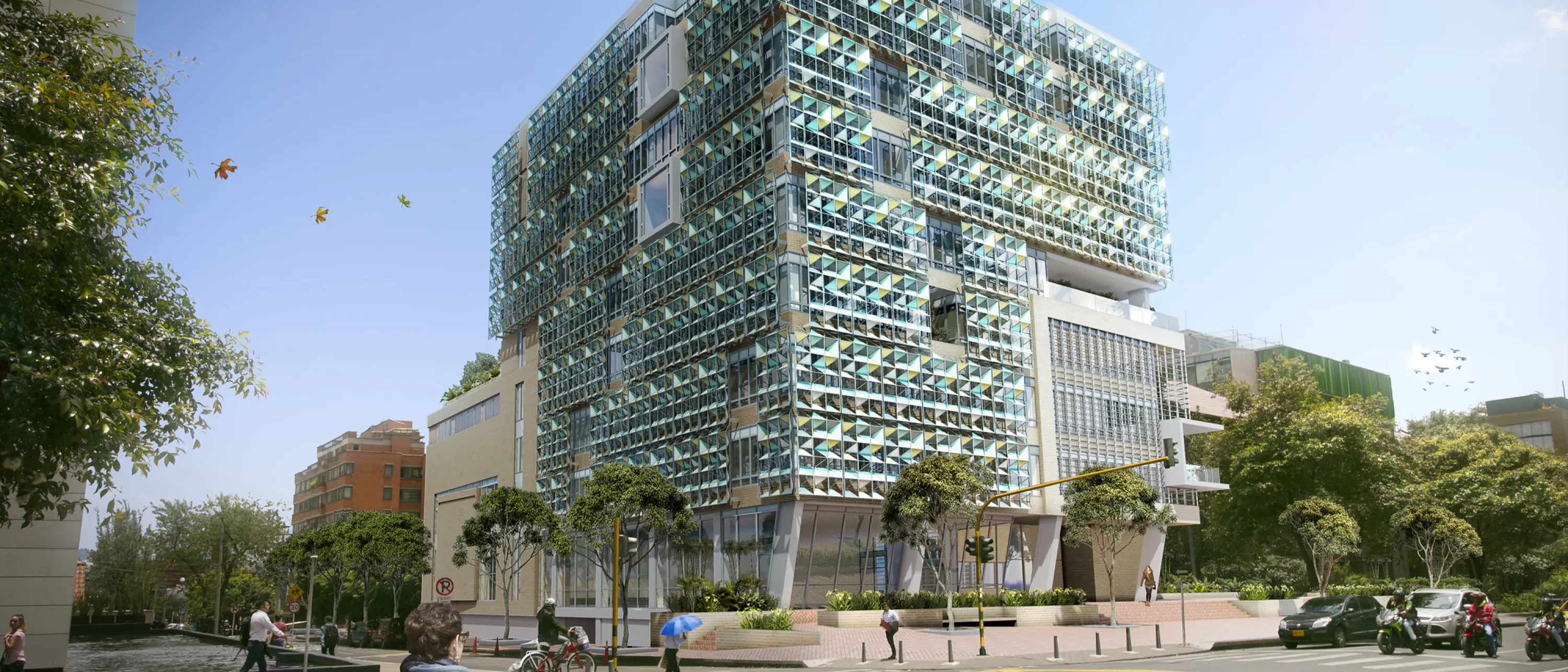
The problem
EAN University is a Colombian institution with more than 50 years of history. Its website serves four distinct user groups: prospective students, current students, faculty and staff.
The legacy site had redundant content and broken links, inconsistent terminology for the same features, and no clear pathways for each type of user. Finding information was harder than it should have been.
My role
As UX/UI Designer, I led the research and information architecture work, designed role-based navigation, built and tested prototypes with every user group, and created the design system that the site would be built on.
Tools: Figma for design and prototyping, Maze and Optimal Workshop for research and testing, Google Forms for surveys, and Illustrator for visuals.
The approach
Research and strategy
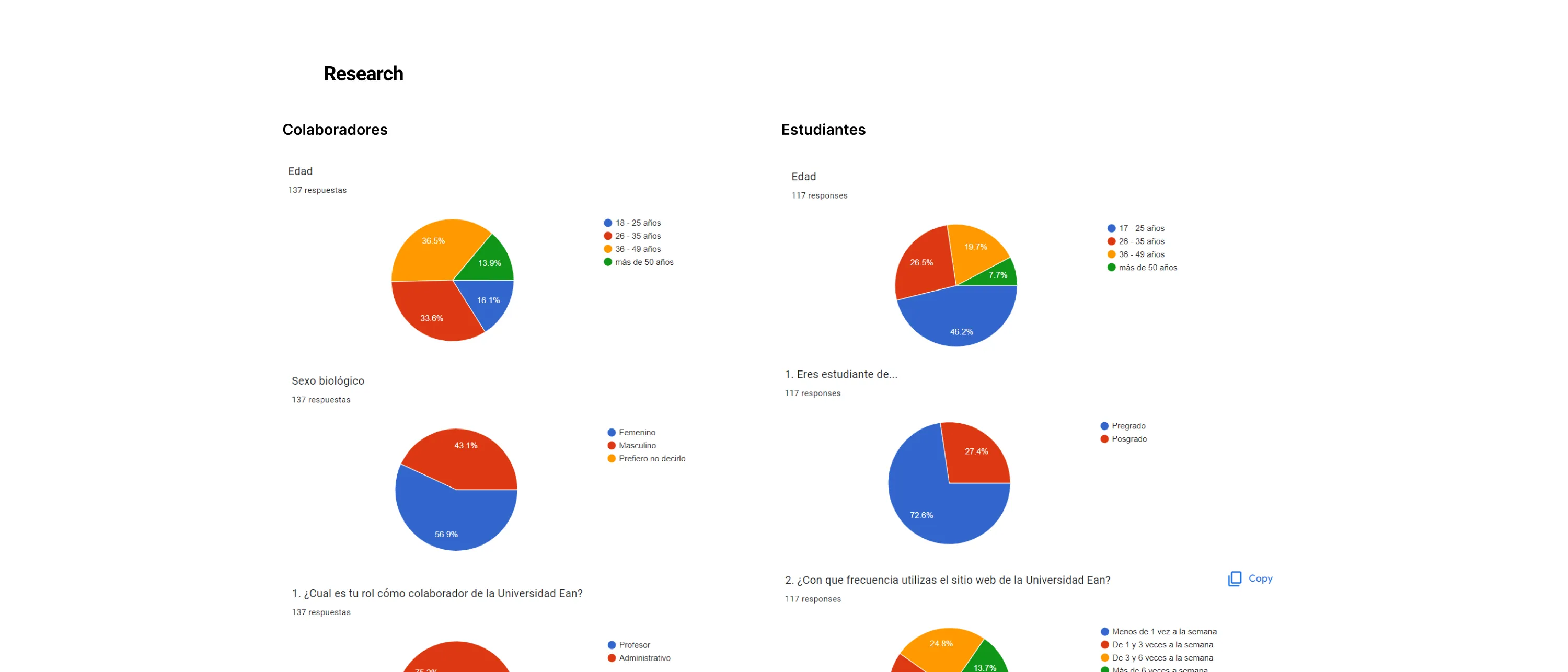 Graphs with the results of the surveys
I started with stakeholder workshops to align on objectives, then ran one-to-one interviews with administrators, faculty and students. I also carried out a heuristic evaluation of the existing platform, a competitive analysis of five or more university websites, and created detailed user personas and empathy maps.
Information architecture
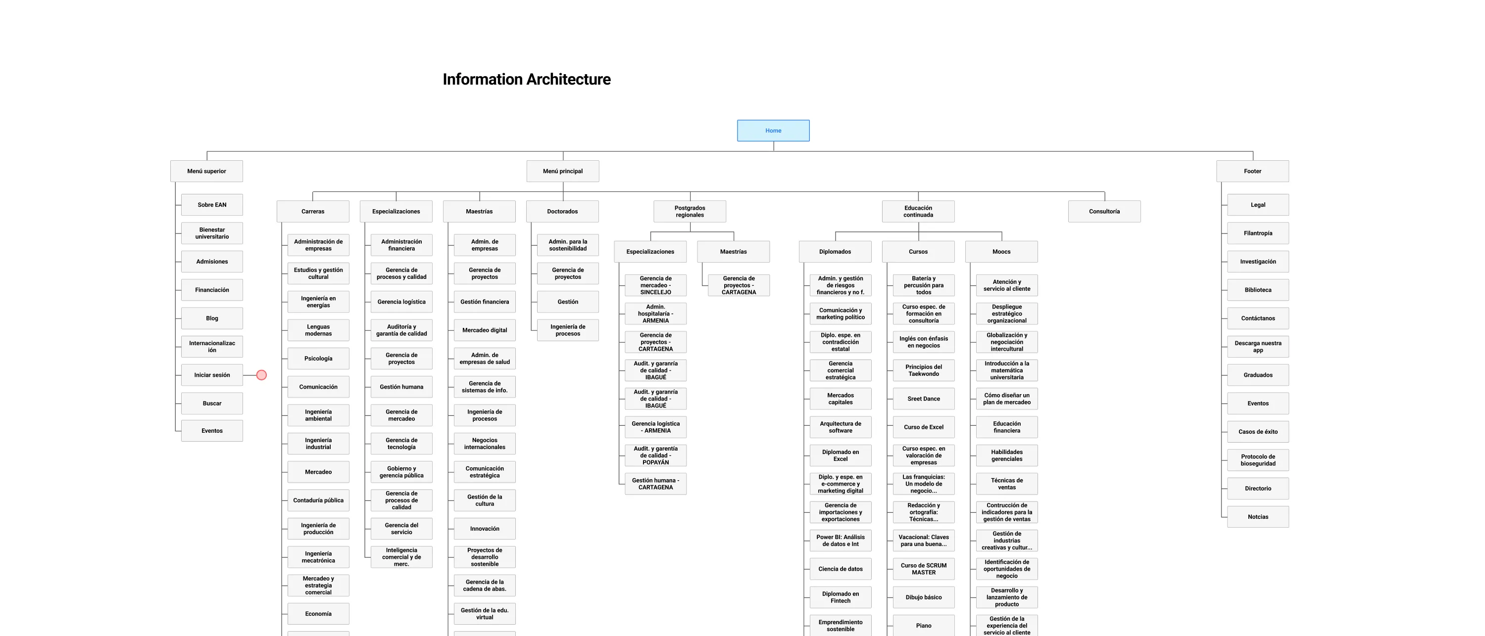 Proposed new information architecture diagram
I reduced the site’s redundant content by 40% and unified inconsistent terminology across departments, so each feature had one clear name. I then designed role-based navigation paths for prospective students, current students, faculty and administrative staff, so each group could find what they need quickly.
Iterative validation
I tested low-fidelity prototypes with all four user groups and ran three rounds of usability testing, reaching an 85% task success rate. I refined the designs based on those results and on accessibility feedback, aiming for WCAG compliance.
Design system
I created a comprehensive component library and documented its patterns in Storybook, so developers could build from the same components the designers used. The system keeps the brand consistent while making the site easier to use.
The outcome
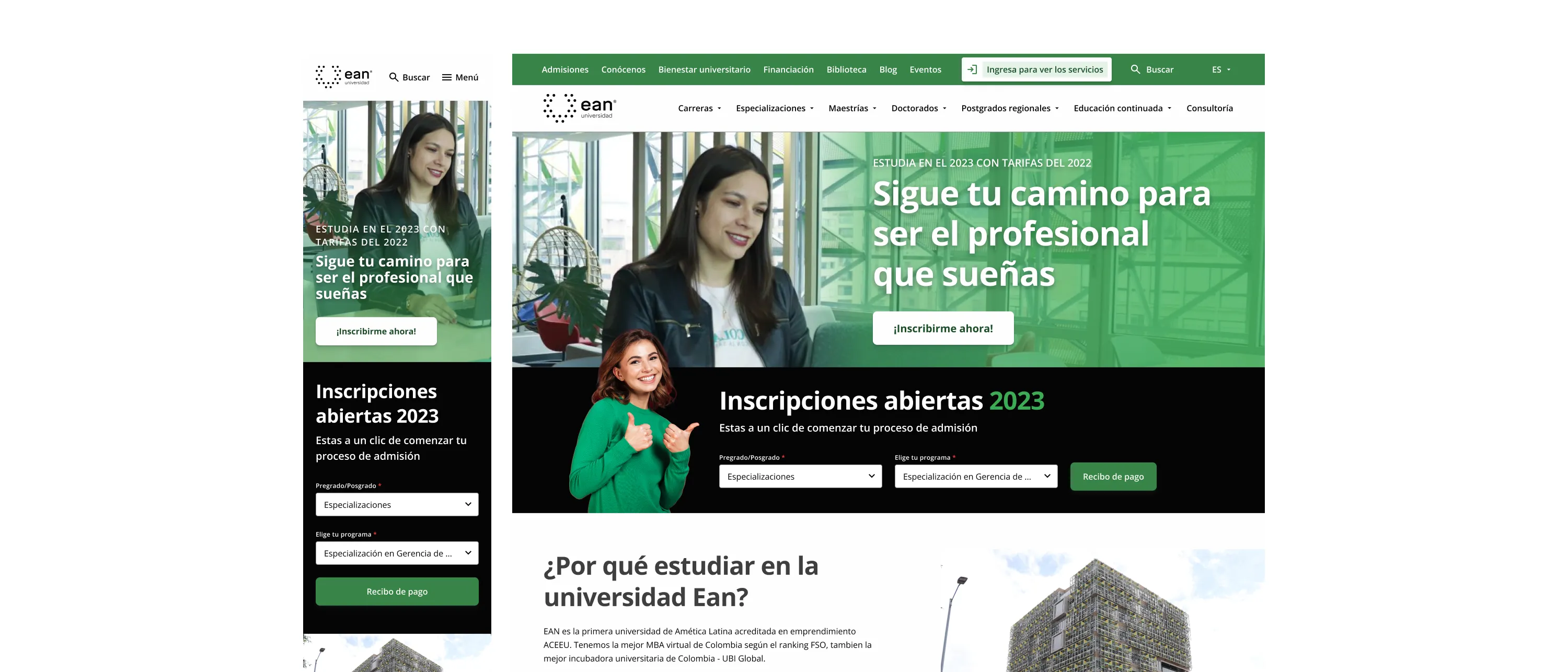 Mockup of the Home page design
The project was delivered as a complete design, but it was not developed. Its results come from the design and testing work:
- 85% task success rate across all four user groups in usability testing
- 40% of redundant content eliminated
- All identified navigation issues addressed, with one clear set of terms across the site
- 40+ prototype screens covering role-based flows
- A WCAG 2.1-aligned design system, documented in Storybook for developer handoff