2025 · Shipped
Pluxee’s One App
UX design engineering case study: rebuilding a rebranded payments app for 2M+ users across six LATAM markets, with a Storybook design system shared by design and code.

The problem
Pluxee’s legacy app, One App v2, had grown inconsistent. Screens followed different patterns, and key journeys such as onboarding, card management, QR payments and store discovery felt fragmented. Users were leaving tasks unfinished, and retention was falling.
Midway through the project, the company rebranded from Sodexo to Pluxee. The redesign became a full design system overhaul: the new identity had to work consistently across an app used by more than 2 million people in six countries, under real technical constraints.
The goal was clear: a global app that feels coherent in every market, carries the new brand, and can be built and maintained reliably by engineering.
My role
As Lead Designer and UX Consultant, I aligned stakeholders on goals and success metrics, led user research, and owned the design direction from discovery through developer handoff. I partnered with Product Owners and marketing teams in six countries to adapt the experience to regional needs while keeping one shared system. After launch, I supported QA with visual validation to protect design quality in production.
Tools: Figma for research synthesis, flows and high-fidelity design · Confluence for documentation · Storybook for the component library · Firebase and Amplitude for release and product analytics.
The approach
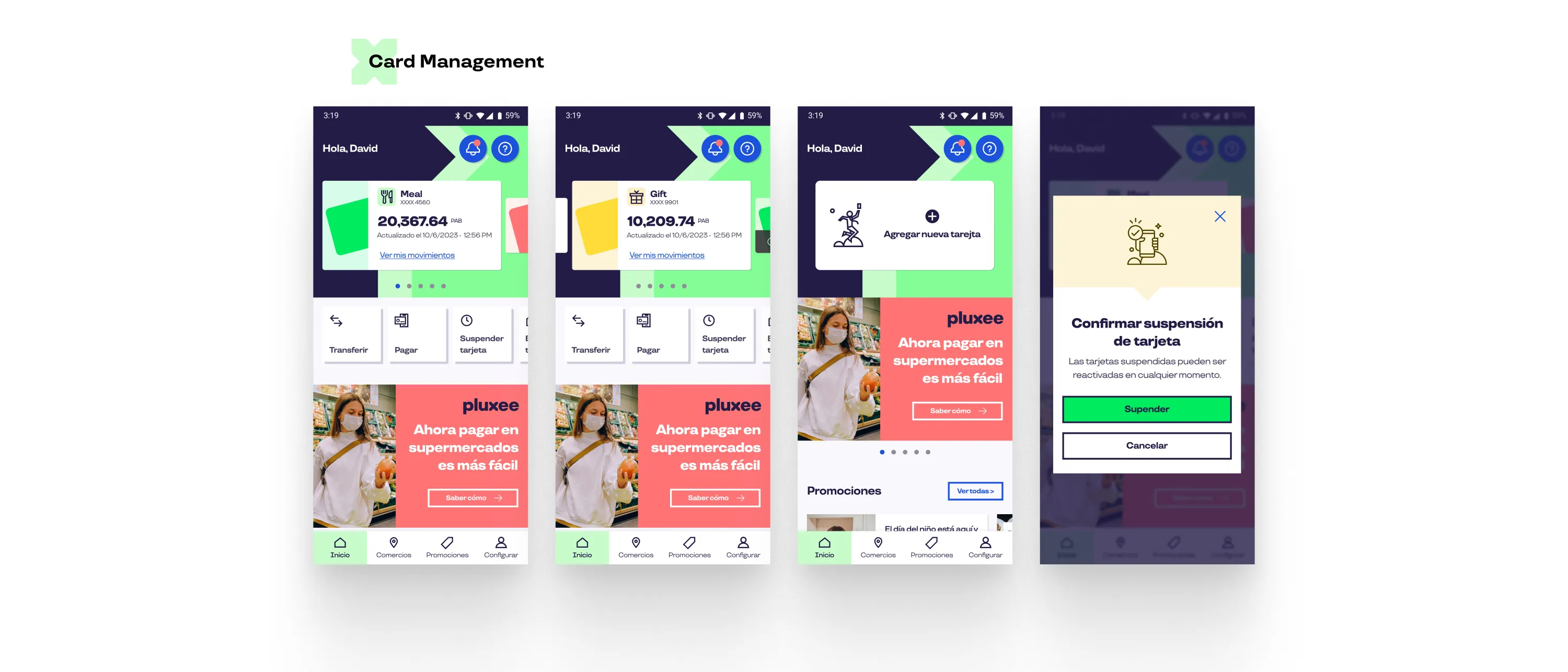 Multiple screens for the Home and Card Management flow
Research and strategy
I started by agreeing on success metrics with stakeholders, so every design decision had a measurable target. I then ran user interviews and surveys across four key flows: onboarding, card management, QR payments and store discovery. I also analyzed competitor apps to spot industry trends and gaps One App could own.
Information architecture and design
I restructured the app’s information architecture to simplify navigation and make core journeys easier to complete. From there I moved quickly through wireframes into high-fidelity mockups in Figma, built directly on the new Pluxee design system, so the redesign and the rebrand launched as one coordinated release.
Design system and developer handoff
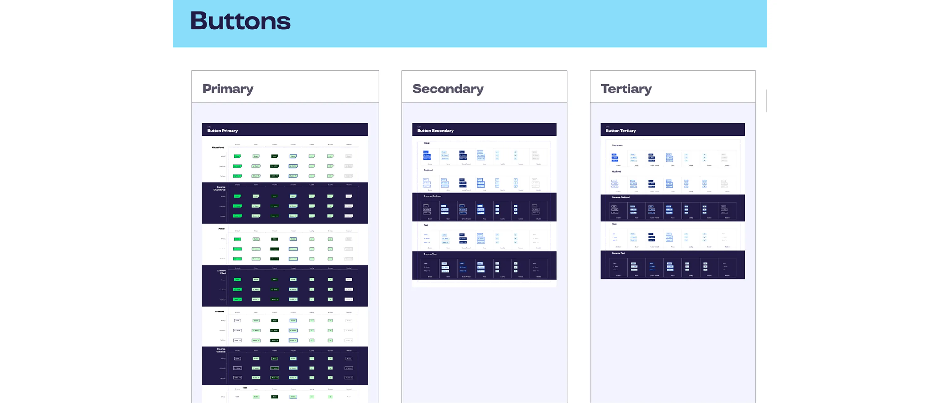 Part of the new design system implemented in the project after the rebrand
Inconsistency was the root cause, so the solution had to be systemic rather than screen by screen. I built a component library in Storybook where every component documents its states and usage rules. Designers and developers work from the same source of truth, which keeps the implementation faithful to the design and makes handoff fast and predictable. This is the core of how I work as a design engineer: shipping design decisions as reusable, production-ready code.
The outcome
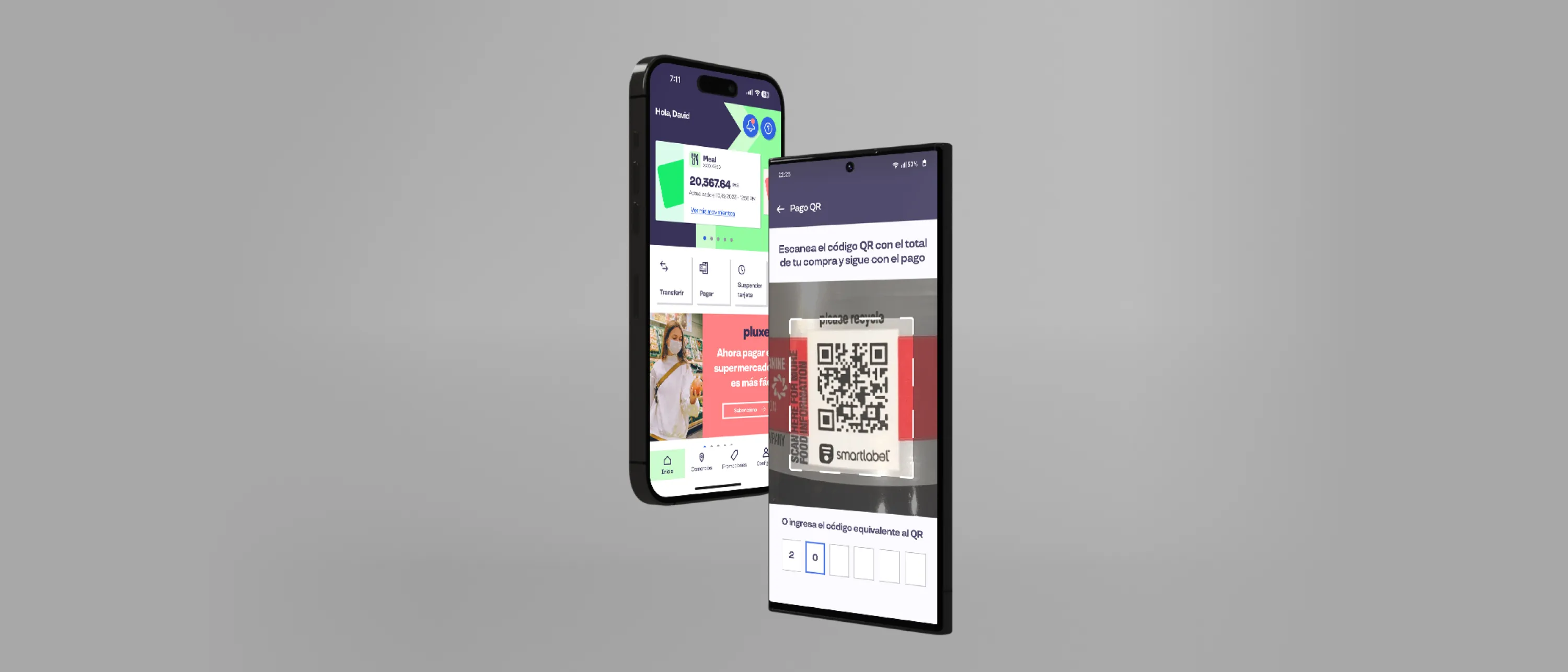 Mockup of the app
After the first release, the redesign moved the metrics the project was measured against:
- User retention rate: +16%
- Task abandonment rate: −26%
- App session duration: +17%
- Conversion rate (transactions and purchases, averaged): +12%
- Net Promoter Score (NPS): +10 points
- User acquisition cost (CAC): −6%